Visual identity of the Argentine Pavilion for the Fair Frankfurter Buch Messe, 2010.
This brand won the first prize in the competition.
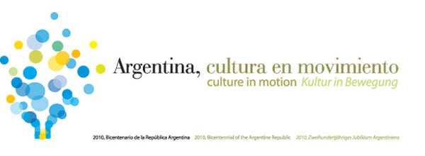
The brand
In this scheme, the visual brand portrays the effervescence of Argentina from the dynamism of a culture whose distinctives traits are pursuit, diversity, the sum of relations, ransparencies and lively articulation of identities. This is translated into a constant and colorful proliferation of new expressions.
The brand depicts the concept of Argentina as a culture in motion. This concept is expressed as much through the slogan chosen as its visual symbol. The symbol performs an active interpretation of its culture, thinking of the national flag as a dynamic space for creation and production.
This effervescence comes from a national space but it also travels and projects outside its own space. Thus, the brand portrays this movement of the pursuit of the Argentines, marking the alchemical moment of the creation of their cultural expressions. This creation is sometimes contradictory, but unique.
The graphic referents
Color and purity of form of the symbol are the elements of greatest impact on all aspects of the identificatory brand. For this reason the rest of the elements involved seek to complement and contain the impressions of this picture, leading the general perception of the viewer towards a position understood as ideal. Thus, the slogan of the old typography brings to the body a certain classic component and the complimentary German typography brings other present components. These graphic resources may be ranked by certain parts and communicative contexts, without disrupting the main body.
©Sebastian Guerrini, 2009


me gusto porque es bastante expresivo.
Saludos!
Gracias Lukas, saludos.
Sebastian