Post-Harvest Systems. Brand design, naming and slogan creation. Pennsylvania, USA, 2011.
Postharvest, was originally a group of companies that focused on pre-cooler and ripening services for fruits.
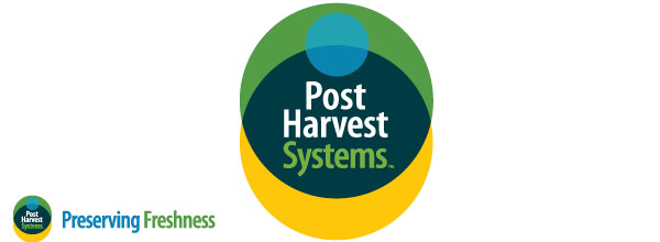
The work I did was first to propose an umbrella brand for all of the companies and suggesting a name and slogan for the Holding.
After that, I designed the brand. I looked here to highlighting some of the history and attributes of the owner of the company, a quite interesting person. Thus, I created a corporate symbol that expresses some associations: one with a banana, because the owner of the company is one of the global referent of the theme (the yellow strip below); a blue touch proper of the cooling activity and a referent of the freshness that Postharvest offer to its clients (the green strip above).


