Design of Societat Organica identity, study of Sustainable Architecture and Urbanism (Barcelona, 2003-2004)
In order to design the brand of Societat Organica, the organization was first investigated in depth. From its vision of environmental issues and the specifics of construction, to its growth strategy as a company; from its reality and its potential to its aims as a group of professionals who dream of a better future.
Images were also uncovered relating to SO’s action towards creating a unique message, distinct from its competition but integrated with the philosophy of the sector.
Aligning this material with existing and outstanding attributes from their market reality, a political image was interpreted and suggested that helped capture a scene from the life of SO. This allowed for the definition and creation of a consensus regarding their position, understood by all to be optimal for the study.
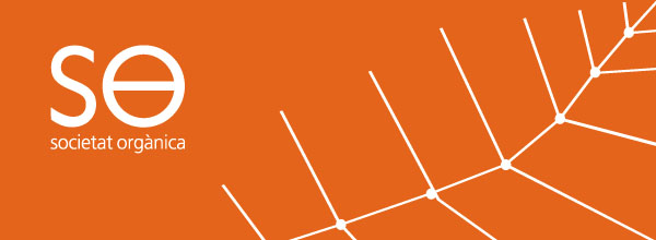
Subsequently, four brand options were presented, all expressing this position, but narrating distinct ideas from the visual identity. One of them formed the parallelism that can be seen between organic plant growth and ideal urban planification. This is materialized in the shape of the veins of a leaf that resemble the plan of a group of houses. This was the proposal selected.
In addition, the institutional color was adjusted, the brand was programmed onto the web to give it life and interactivity, and the implementation of the identity was applied to stationery, brochures, etc.
©Sebastian Guerrini, 2009


