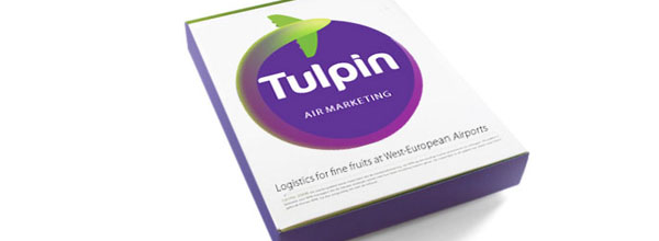
Tulpin Group. Air logistic for fine fruits. Brand Design. Oostende, Belgium. 2011.
The created image for the Tulpin Group, brings freshness and dynamism to the act of the fruits air transport. The shape of an airplane is fused with the one of a vegetable, and the route of the figure creates a sense of mastery over a circular space, a circle associated with that of our planet. The typography of the brand helps to convey modernity and proximity, in a market where companies use to be represented by rough graphics and away from fruit essence.


Definitely correct. I was a syhpnomy-level performing flutist, but I now cannot stand or enjoy anything baroque, or anything I would have performed. It has to do with burnout. Once you feel you’ve conquered something, it might be time to move on. It’s a kind of boredom that saps the pleasure out of something. As humans, we are also multi-faceted. I tend to be 5-faceted. If I am to be creative, I have to rotate 5 different types of creative projects routinely to keep the passion alive. Sticking to one subject is just deadening.